Phoenix: Mapping Forest Fire Damage Recovery
April 19th, 2025
// The Problem
When a natural disaster strikes, it can destroy homes, disrupt economies, and deeply affect communities. To plan for recovery and reduce future impacts, experts rely on models that predict how communities recover after disasters. But many of these models are built on limited or outdated data, and there’s no clear way to check how accurate they really are. Without reliable benchmarks, it’s hard for policymakers, aid organizations, or insurance companies to fully trust the predictions these models produce. That makes it harder to plan effective responses that truly meet the needs of affected communities.
// Our Approach
This project builds a framework that uses satellite imagery to track how communities recover after a disaster—specifically, wildfires. It starts by analyzing pre-disaster images to set a baseline, then compares that to new images over time to monitor rebuilding and recovery. The tool is accessible through an interactive webpage where users can explore damage in areas they care about. The system was tested with a case study in Paradise, California, after the 2018 Camp Fire, and it gave helpful insights into the pace and pattern of recovery. Over time, expanding this approach to more disasters and communities will create a strong dataset to improve future planning and make disaster response more informed and effective.
// Methodology
This project combines a two-phase deep learning approach with an interactive interface to create a scalable framework for analyzing recovery from satellite imagery. The key aspects include the two-phase model for building localization and damage classification, an interactive map-based interface, and post-processing for converting pixel-wise masks into vectorized building polygons for further analysis.
To run the models developed in this project, an NVIDIA 1070 Ti GPU was used for all computationally intensive tasks. The trained models were loaded into GPU memory and remained resident there to handle inference requests with minimal initialization overhead. While hosting these models on a dedicated cloud service (such as Amazon Web Services) is common practice, this project used a local GPU environment instead. This eliminates ongoing expenses associated with cloud-based GPU instances.
// Our Solution: Phoenix (Software)
This project uses satellite imagery as the foundation for both its visualization and analysis components. The Leaflet JavaScript library powers the user interface, enabling users to interact with layered maps through zooming, panning, and overlay capabilities. High-resolution historical satellite imagery, sourced from ESRI, is integrated as map tiles within Leaflet, allowing users to view extensive geographic areas and analyze the pre-disaster state of affected regions.
On the modeling side, a building localization model was developed to segment building footprints from pre-disaster images. This model uses a ResNet34 encoder pre-trained on ImageNet, paired with a decoder that outputs pixel-wise building masks. Given the imbalance between building and non-building pixels, the training process incorporates both Dice loss and Focal loss to improve segmentation quality. The model was trained using data from the Defense Innovation Unit (DIU), which includes annotated satellite imagery. Data augmentations helped improve generalization, and the final output is a mask identifying buildings within the input image.
The damage classification model builds on this output by analyzing pairs of pre- and post-disaster images using a Siamese network structure. Each image passes through identical encoder branches, leveraging shared ResNet34 weights, and the resulting features are merged to classify damage levels—ranging from no damage to destroyed. The classification model is guided by the building masks from the localization model, using a dot product to ensure predictions are made only within identified building regions. This two-stage pipeline ensures accurate, structure-specific damage assessment based on satellite imagery.
// An Example
The implementation of the complete framework produces visual and technical insights into pre‑ and post‑disaster conditions. Visually, an overlay of predicted damage classes on the affected area is displayed in the interactive interface. Segmented polygons are then analyzed to reveal data-driven insights to the recovery process in a community.
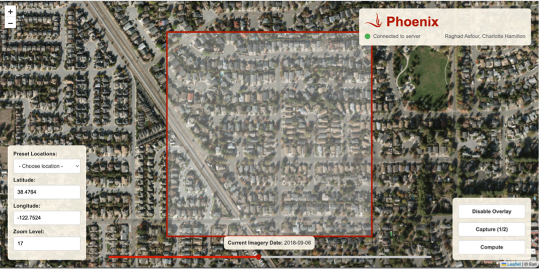
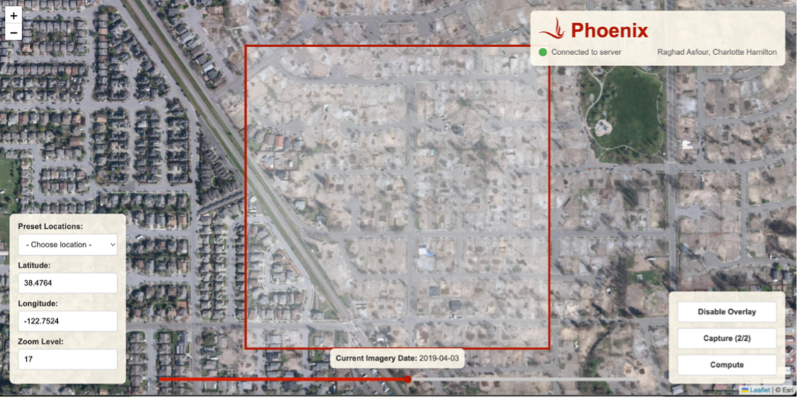
Figure 1 and Figure 2 show a neighbourhood in Santa Rosa, California before and after a forest fire. The pre-disaster image (Figure 1, dated 2018‑09‑06) depicts the area totally intact, while the post-disaster image (Figure 2, dated 2019‑04‑03) shows widespread destruction, with many structures having been reduced to their foundations.
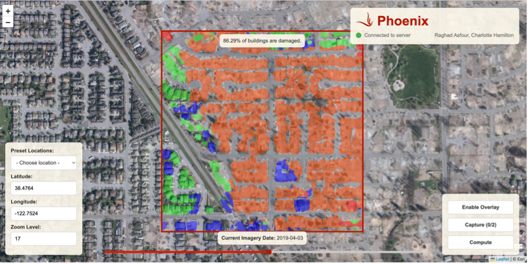
Figure 3 shows the results of the damage classification model over the same area. In the selected area, 86.29% of the buildings were classified as damaged. The overlay displays four colors, each corresponding to a different level of damage, from minimally affected (green) to fully destroyed (red).
These results show the model’s ability to generate high-resolution, easily interpretable damage assessments. Unlike binary “damaged/undamaged” models, this multi-class system offers a more nuanced view into the state of each structure. Pockets of less severe damage (green) can be seen among clusters of moderately damaged to complete damage (orange, blue, and red), offering visual insight into spatial variability within a small area.